

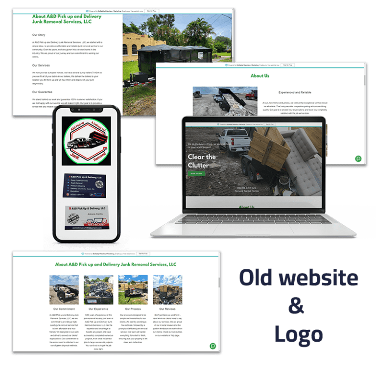
The problem
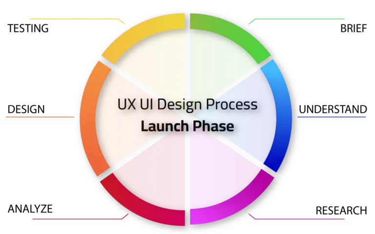
THE PROCESS
THE brief
Logo Redesign
- Retain the key elements of the existing logo (pickup truck and dumpster trailer).
- Update the color scheme to incorporate the white, blue, and red palette.
- Create a modern and streamlined logo design that maintains brand recognition.
Single Page Web Design
- Develop a modern, user-friendly, and visually cohesive single-page website.
- Ensure that the website reflects the new logo design and the white, blue, and red color palette.
- Implement a booking system to facilitate service reservations.
- Maintain a clean, organized layout with clear navigation.
- Optimize the website for both desktop and mobile devices.
Project Timeline
The client has requested the completion of this project within a two-week timeframe. This timeline should be taken into account for all design, development, and testing phases.
understand
Project Deliverables
- Redesigned Logo: An updated logo that aligns with the new color scheme and maintains brand recognition.
- Single-Page Website: A modern, responsive, and user-friendly website with a cohesive design, integrated booking system, and clear navigation.
Key Requirements
- Retain the key elements of the existing logo (pickup truck and dumpster trailer).
- Update the color scheme to incorporate the white, blue, and red palette.
- Create a modern and streamlined logo design that maintains brand recognition.
Project Challenges
- Ensuring a seamless transition from the old logo and website to the new design.
- Integrating the booking system seamlessly to provide a user-friendly experience.
- Balancing visual appeal with functionality to create an impactful online presence.
rESEARCH PHASE
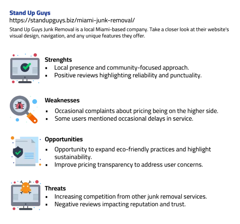
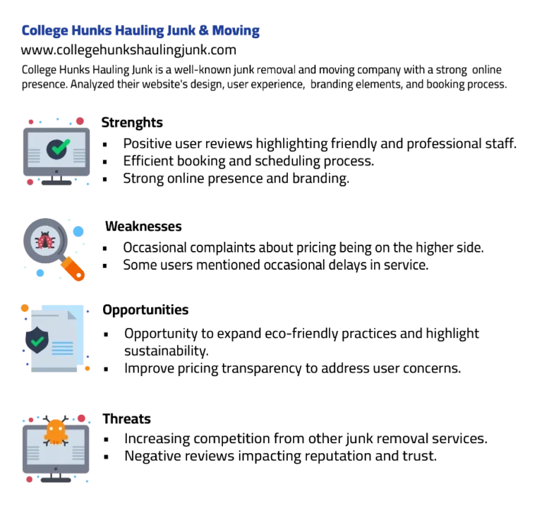
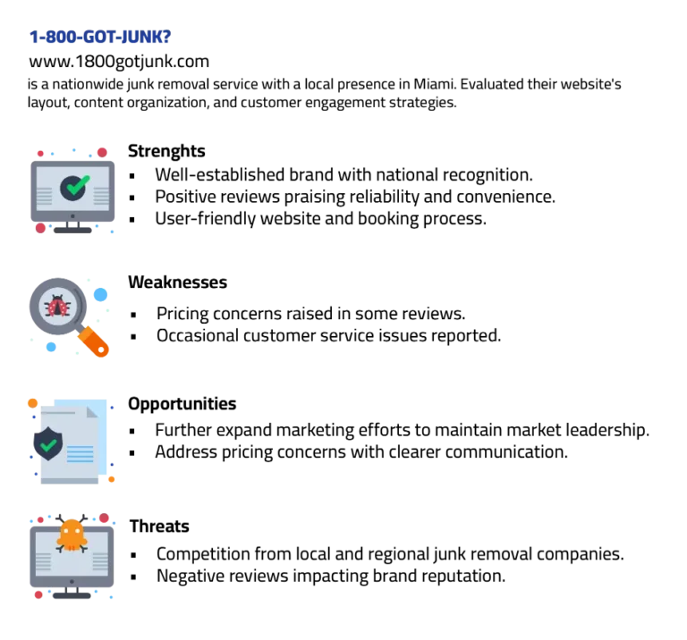
COMPETITORS ANALYSIS
USER PERSONA

design PHASE
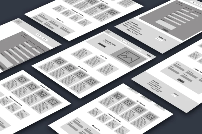
LoFi wireframing
HiFi wireframing

FINAL pRODUCT


conclusion
Through this case study, I’ve gained invaluable insights into the world of UX/UI design. It reinforced the idea that quick research can be a powerful tool for identifying and addressing user pain points. By empathizing with their frustrations, I was able to craft meaningful solutions that elevate the user experience. This project highlighted the importance of user-centered design, and it taught me to continually prioritize transparency, efficiency, and reliability in my work. The journey has been a learning experience that strengthens my commitment to delivering designs that put users at the forefront, ultimately resulting in better experiences for all.
PhotoProFinder: Mobile App
Solo Project

Toxic Bear: E-commerce Web design
Solo Project